


Role
UX Researcher
UI/UX Designer
Team
Group research
Individual design
Project type
Academic Project
E-Commerce Platform
Timeline
12 Weeks
Research → Design → Test → Iterate

MOBILE & WEBSITE APPLICATION
Compiled
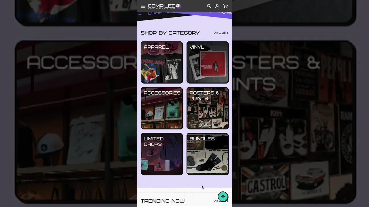
Compiled aims to make buying music merch easier by bringing multiple artists and their merchandise together in one place. I worked on the research, user experience and website design to create a platform that makes discovering, browsing and purchasing merch simpler.
The Context
In the current merchandise landscape, music fans often have to navigate between separate artist websites, social media accounts and concert merchandise booths to find the products they want.
Compiled explores how a multi-artist merchandise platform could bring discovery and shopping into one place. The goal is to help fans browse across artists, understand their product options and make purchasing decisions with greater confidence.
Compiled aims to target music fans aged 18–35 who actively follow artists and bands online and purchase merchandise either regularly or occasionally.
How might we…
How might we bring merchandise from multiple artists into one connected platform, making it easier for music fans to discover products and make informed purchasing decisions?
Research
Our group conducted competitor analysis, surveys, interviews and observations. We collected 53 responses from people aged 18–24.
My contributions included two competitor analyses, designing the questionnaire, an interview with a pontential user and an observation at a music café.
Key Insights
Insight 1
Discovery Feels Fragmented
Respondents cited that they struggled to find official stores and wanted an easier way to browse across artists.
Design implication
Bring both artist discovery and merchandise shopping into one platform.
Insight 2
Product Choices
Need Clarity
Merch pricing and design affected purchase decisions. My interviewee also cited a bad experience due to rushed decision making at a concert.
Design implication
Prioritise clear imagery, product pricing, sizing and key merch details.
Insight 3
Visual Appeal ≠
Platform Usability
Our competitors had aesthetic websites, but pain points such as insufficient feedback, readability issues and unclear purchase actions affected usability.
Design implication
Make buttons, selection states and key information easier to identify.
UX Mapping
The activity map, affinity diagram, persona, user scenario and current & proposed user journey maps helped me to better understand and empathize with potential users.
Design Decisions
Decision 1
Bring Artists Together
Artist-based browsing and featured collections support both targeted searches and open-ended exploration.

Decision 2
Make Choices Visible
Colour swatches, selected-state labels and clearer product-information sections make options easier to scan.

Decision 3
Give Shoppers Control
In-cart quantity controls and a checkout back button let shoppers adjust their order or return to browsing.


Testing Insights
To test my prototype,
I conducted three heuristic evaluations, one of which is a self evaluation.
From there, I prioritised key issues affecting control and recovery, then refined visual clarity and feedback.

Prototype Iterations
Iteration 1
No Clear Checkout Exit
There was no obvious way to navigate backwards if users changed their minds. I added a back arrow so users have a visible route back to shopping.

Iteration 2
No Error Pages
Users who hit a broken link or maintenance wall would be left confused. I designed error screens with clear messaging and a highly visible "Back to Home" button.

Iteration 3
Competing Background
The cart menu lacked sufficient contrast, causing the background to compete for user's attention. I added a dimmed backdrop to make the active cart the main focus.

The Outcome
Through Compiled, I translated my research into a multi-artist shopping prototype and addressed nine heuristic concerns through the interface and prototype revisions.
Reflection & Next Steps
This project taught me how small interaction details can matter alongside the overall concept. Moving forward, I would test the discovery-to-checkout journey with target audiences who were not part of the assignment to get clearer insights on the overall usability.

View Other Projects

MOBILE & DESKTOP APPLICATION
FitFlow
FitFlow is a responsive fitness app that combines personalised workouts, activity tracking and clear progress insights to help busy users fit fitness into their everyday lives.

MOBILE APPLICATION
Dive Deep
Dive Deep is a location-based mobile app concept that transforms Melbourne Museum into an interactive deep-sea expedition, inviting visitors to uncover stories through artefact-led discovery.

MOBILE APPLICATION
Better Binding: Buddi
Buddi is a scrapbook‑style wellbeing app designed to help transgender and gender-diverse youths safely track their binding journey and body comfort through gentle and personalised check‑ins.

Shannon
Liaw
shannonliaw.yh@gmail.com