


Role
UX Researcher
UI/UX Designer
Team
Individual research & design
Project type
Academic Project
Designed for Melbourne Museum
Timeline
12 Weeks
Concept → Design → Test → Refine

MOBILE APPLICATION
Dive Deep
Dive to descend. Document the deep.
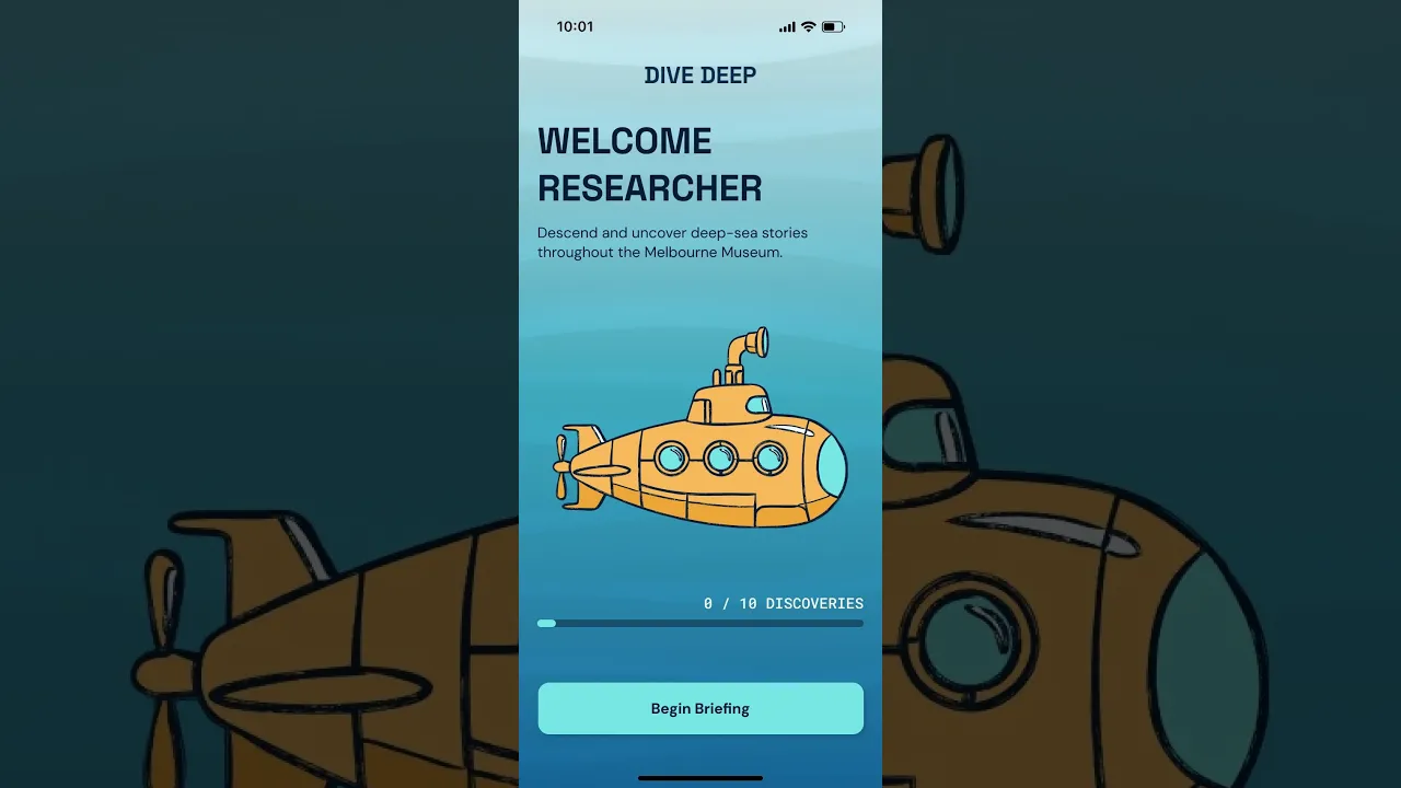
Developed as an academic project for Melbourne Museum, Dive Deep is a mobile app concept that turns the typical experience into a deep-sea expedition. Visitors are tasked to locate ten artefacts and complete short activities as they descend towards the abyss. I developed the concept, narrative and prototype, while refining the experience through field testing and focus-group feedback.
The Context
The objective was to design a mobile storytelling experience that complements the museum space and artefacts without distracting visitors from the physical collection.
Designed for visitors aged 16–30, Dive Deep combines a guided treasure hunt narrative with optional exploration. The journey starts with marine discovery and the descent reveals evidence of human activity in the deep ocean, inviting users to reflect while keeping it fun and lighthearted.
How might we…
How might we turn a typical museum experience into an interactive journey that connects discovery, learning and reflection at the Melbourne Museum?
Research
I began with researching the Melbourne Museum catalogue, then developing nine ideas before narrowing them to three concepts.
As I narrowed down my concepts, I conducted a focus group with four participants aged 21–24 to learn about their museum habits, concept preferences, navigation habits, as well as willingness to share device permissions.
Upon completing my prototype, I conducted a museum field test and another focus group to evaluate and identify areas for refinements.
Key Insights
Insight 1
Visitors Wanted Guided & Free Exploration
Participants wanted to have a clear objective and visible progress, while also having the choice to freely explore at their own time and pace.
Design implication
Design a fixed 10-artefact journey, with an optional exploration through Dive Deeper.
Insight 2
Interactions Should Support Discovery
Participants preferred when the activities are quick and varied, especially if they are relevant or taught them something about the artefact.
Design implication
Design activities around the artefacts and provide short copies and fun facts.
Insight 3
Permission Access Should Be Optional
Participants wanted clear reasons for device permissions, while having alternatives if they decided not to provide camera, mic and location access.
Design implication
Explain access use and provide alternative interactions with "skip" options.
UX Mapping
I created a user scenario and storyboard, then mapped out the interaction flow to connect the museum journey with the on-screen experience.
Then I sketched lo-fi frames to based on the interaction flow, from onboarding and artefact discovery to recording finds and the post-expedition activities.
Design Decisions
Decision 1
Tie Artefacts To The Descent
Participants liked how the artefacts created a journey from the surface to the abyss. The darkening of backgrounds, depth indicator and research log communicated progression.


Decision 2
Make Interaction Part of Learning
Participants found activities which educated them about the artefacts memorable. An example of that is the Blobfish slider which taught them about how pressure affected its looks.


Decision 3
Offer Post-Expedition Activities
Participants really enjoyed the optional word cloud, personalised photo keepsake and Dive Deeper section as it allowed them to further engage with the app.


Brand Identity & Visual Design
I used different shades of blue to reflect the ocean descent and accent colours for key UI elements, keeping the app usable.
Additionally, I included audio cues to enhance the immersion and motions to simulate intended interactions on the prototype.
Lastly, my typography consists of Space Grotesk headings, DM Sans body text and Roboto Mono data labels to distinguish narrative content distance and signal information.
Testing Insights
I tested the first five artefact flows with five classmates at Melbourne Museum, using observations, think-aloud feedback and surveys. They enjoyed the activities but highlighted unclear navigation, missing instructions and unnecessary backtracking.
I also conducted a follow-up focus group with four participants to explore the full journey. They liked the revised map but found some controls and the environmental message unclear.
Prototype Iterations
Iteration 1
Improve The Wayfinding Feature
Participants found the radar difficult to interpret by itself, so I combined the it with a pictorial map and route direction to provide clearer spatial context.


iteration 2
Explain Activities Before They Begin
Participants got stuck at some activities as they did not know how to complete them. I added instruction modals to explain the required action before each activity.


Iteration 3
Reduce Backtracking
Participants said that the transition between levels created unnecessary walking, so I rearranged the proposed artefact locations to create a more direct route while retaining the descending narrative.


The Outcome
Dive Deep developed from an early concept of mine into an interactive prototype journey across the onboarding, artefacts and post-expedition activities.
With the testing methods, they informed the necessary changes I needed to make to improve the usability of the Dive Deep app.

Reflection & Next Steps
Since Dive Deep is designed to be a geo-located museum app, it made me realise that besides the screens, I should also carefully consider and plan the route between artefacts.
The focus group also showed me the importance of storytelling; even if people enjoy an app's interface and activities, they could still be unsure about the story I was trying to tell.
My next step is to let visitors who haven’t seen Dive Deep try it without my guidance. I’d look at where they get stuck and whether the app takes too much attention away from the artefacts.
I’d also work on improving the overarching narrative and if possible, turn the simulated interactions into a working version to test the location, scanning and gesture features properly.
View Other Projects

MOBILE & DESKTOP APPLICATION
FitFlow
FitFlow is a responsive fitness app that combines personalised workouts, activity tracking and clear progress insights to help busy users fit fitness into their everyday lives.

MOBILE & DESKTOP APPLICATION
Compiled
Compiled is a multi-artist music merchandise platform that brings artists, collections and exclusive drops together in one place, making browsing and purchasing merch easier and more accessible.

MOBILE APPLICATION
Better Binding: Buddi
Buddi is a scrapbook‑style wellbeing app designed to help transgender and gender-diverse youths safely track their binding journey and body comfort through gentle and personalised check‑ins.

Shannon
Liaw
shannonliaw.yh@gmail.com